
Best Graphic Design Conferences in 2024
Explore top graphic design conferences in 2024 for unparalleled in-person and online learning and networking opportunities.
February 14, 2024

How Much Do Graphic Designers Make? 2024 Guide
Discover what’s shaping the future of graphic design salaries in 2024.
November 8, 2023

NoD Newsletter
Enhance your inbox with our weekly newsletter.

Free Holiday Fonts Graphic Designers Will Love in 2023
Here are some free holiday fonts you can add to your toolkit to spread some extra joy this holiday season.
October 26, 2023
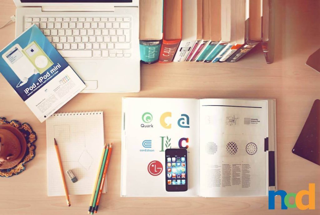
What Do Graphic Designers Do On A Daily Basis?
If you’ve ever been curious to learn the basics of what graphic designers do on a daily basis, now you can finally know.
October 24, 2023

How To Get A Bachelor’s Degree In Photography Online
Unlock your creative potential by pursuing a Bachelor’s Degree in Photography online.
October 17, 2023
What Is Print Design?
What Exactly Is Print Design? And does it still have any relevance within the Digital Age?
October 12, 2023
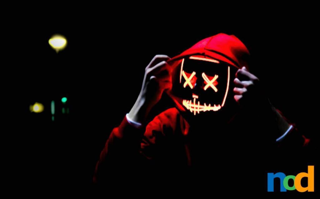
How To Take Scary-Good Night Photos This Halloween
Learn how to turn low-light photography challenges into captivating night shoots.
October 9, 2023
“Should I Be A Graphic Designer?”
Ever asked yourself, “Should I Be A Graphic Designer?” Read This Article To Find Out.
October 4, 2023

Spooky-Fun Halloween DIY Arts and Crafts
Summon your inner designer this Halloween with these cool crafts and spooky projects, perfect for aspiring creatives!
September 21, 2023
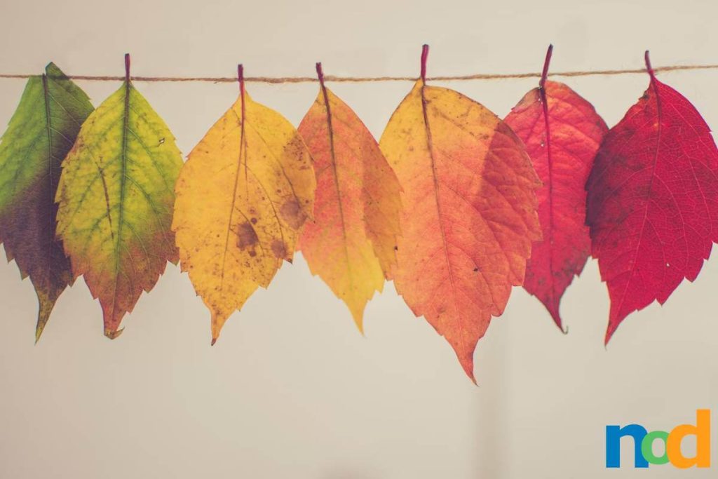
Fall 2023 Color Palettes for Graphic Designers
Discover the top color palettes in Fall 2023 that every graphic designer should use this season.
September 21, 2023
Is Graphic Design Hard?
Is Graphic Design Hard? Unlock the truth as we dive into the challenges and joys of this creative field.
September 15, 2023

Hayao Miyazaki’s Surprise Film The Boy and the Heron Coming December 2023
Hayao Miyazaki’s Surprise Film, “The Boy and the Heron” will be in theaters nationwide on December 8th, 2023.
September 11, 2023
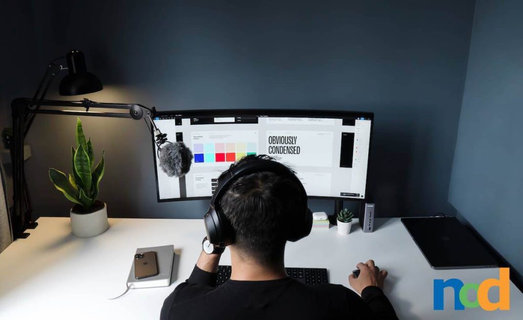
5 Focus Tips for Designers Working From Home
It’s easy to get distracted while working remotely from home, so here are 5 focus tips to help you get through your workday distraction-free.
September 7, 2023
Best Online Graphic Design Programs for 2024
With 2024 approaching fast, here’s a list of the best online graphic design programs to explore.
September 1, 2023
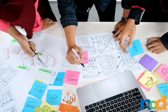
UX vs UI: User Experience & User Interface
It’s easy to overlook the differences between UX vs UI, so here’s how these 2 trades vary.
August 28, 2023
The Use of Pixel Art in r/Place on Reddit
Imagine the entire internet painting on the same canvas all at once. Welcome to r/Place!
August 16, 2023
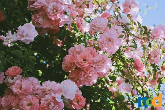
How Does The Color Pink Make You Feel?
Join us as we examine one of the most popping color pigments of all time, Pink.
August 11, 2023
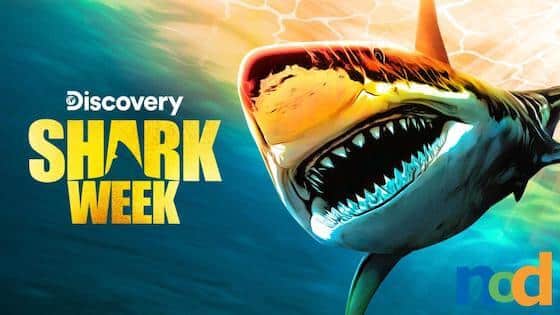
The Designers Behind Shark Week 2023
Dive into the deep end of marketing design for Shark Week.
August 8, 2023
New Twitter Logo ‘X’ Says Bye To Blue Bird
Examine the events leading up to the New Twitter Logo and what the new ‘X’ means.
August 1, 2023
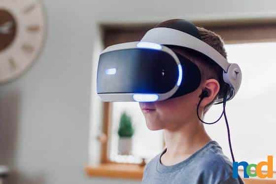
The Future Of Virtual Reality Art & Design
Although VR is a relatively new domain, its creative possibilities are immense.
July 25, 2023